Is the kitchen triangle outdated?
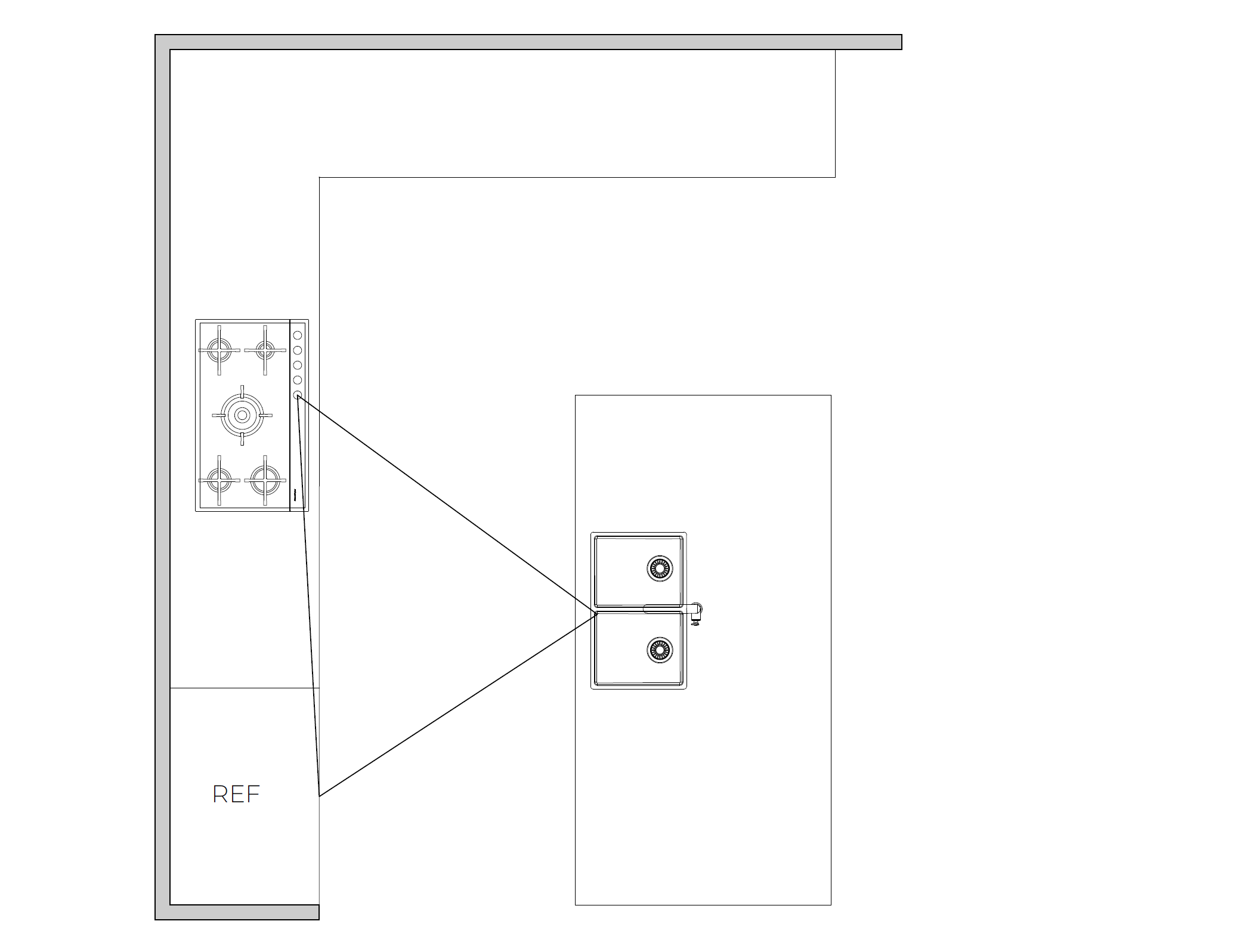
The kitchen triangle or ‘golden triangle is a rule which has been followed for many years in kitchen layouts. This rule states there are three main kitchen work areas in which kitchens should be designed around – the sink, the fridge and the stove. It highlights the natural flow of traffic.
But is the kitchen triangle outdated?
Discover the ins and outs of kitchen triangles and explore zoning inspiration for your kitchen.
Read more from Melbourne Interior designer, Miri Interiors to get inspired.
The kitchen triangle rule explained
To make a kitchen triangle work, you need to create an uninterrupted flow between the three areas (sink, fridge and stove). These three areas shouldn’t be too far apart, or too cramped in proximity.
Measurement wise, the distance between areas/elements should be no less than 1200 mm and no more than 2700 mm.
In a visual sense, your kitchen triangle should flow in a rotational movement between chopping/peeling and prepping ingredients, to cooking on another side, and storage accessible near the fridge for as needed.
So, to answer the all-important question – is the kitchen triangle outdated? Yes! Although it serves as a good foundation for smaller kitchens, it’s not recommended for large, modern kitchens.
An example of the Kitchen triangle
HOW TO MAKE A KITCHEN TRIANGLE SERVE YOUR CONTEMPORARY WORKFLOW
When properly planned out and brought to life, the kitchen triangle can still be a very useful layout – mainly in small kitchen designs.
However, it’s true that kitchen triangles aren’t for everyone anymore. With kitchen zoning becoming the way to go, especially for more modern kitchen designs in Melbourne homes.
Many modern kitchen designs make space for big kitchens over small, with focus now on open concept, impressive pantries and large islands and big bench space.
3d Rendering from Brook House. This image showcases the oversized kitchen island with lowered seating
Understanding kitchen zones
Now, let’s look at the kitchen triangle’s competition – zoning.
When looking at zoning inspiration for your kitchen, make sure the designs include:
An area for people to gather, but still be out of the way of the cook(s)
As the kitchen is so often the heart of the home, it’s a natural meeting place.
Older-style kitchens can make this too cramped and awkward. Efficient kitchen zoning is your functional friend.
An area to sit, work, read and enjoy a bite to eat
An area that allows one person to prep and clean while the other cooks.
Kitchen zoning solves many functional problems that a kitchen triangle doesn’t. In my new upcoming Master your layout: Kitchen edition workshops, I share all my reasonings and tips as to why kitchen zoning is the number one choice for balancing function with aesthetic appeal.
You can still definitely blend the traditional triangle kitchen rule of old, with the new favouritism of zoning. It just takes some tweaking, innovation and collaboration with a kitchen design expert.


